Colour Theory in Gourmet Presentation
Ever noticed how the most memorable dishes are not just delicious — they’re also beautiful? There’s a reason your eyes light up before your fork even hits the plate. Colour plays a powerful role in how we perceive food. It influences our appetite, our enjoyment, and even how we remember a meal.
Whether you’re hosting a dinner party, plating a restaurant-inspired meal at home, or simply wanting to make your food look more appealing, understanding plating colour techniques is a game-changer. Far from being about aesthetics alone, gourmet food colour pairing taps into psychology, contrast, and composition — helping you create plates that look as stunning as they taste.
This guide will help you see colour through a chef’s lens. We’ll cover key principles from art and design, explain how they apply to food aesthetics, and give you the tools to plate like a pro. With practical tips and inspiring examples, you’ll learn how to balance tones, build contrast, and choose vibrant combinations that elevate every dish.
Why Colour Matters in Food Presentation
Visuals shape taste perception
We don’t just eat with our mouths — we eat with our eyes. Studies have shown that visual appeal affects flavour perception, with diners reporting food as more enjoyable or flavourful based on how it’s presented.
A well-balanced, colourful dish can:
- Stimulate appetite
- Create emotional responses (warm tones can feel comforting, cool tones refreshing)
- Enhance flavour expectations
Colour not only beautifies — it tells a story, sets the mood, and influences how a dish is received.
Gourmet plating is rooted in design principles
Great chefs don’t plate by accident. They use tools borrowed from artists — colour wheels, contrast theory, visual weight — to construct their compositions. The same techniques can be applied in a home kitchen with the right guidance.
The Colour Wheel: Your Plating Secret Weapon
Understanding the basics
The colour wheel organises colours into primary (red, yellow, blue), secondary (orange, green, purple), and tertiary shades. It’s the foundation of many food aesthetics strategies.
The relationships between colours on the wheel determine how they’ll look together on a plate.
- Complementary colours: Opposites on the wheel (e.g., orange and blue) create vibrant contrast.
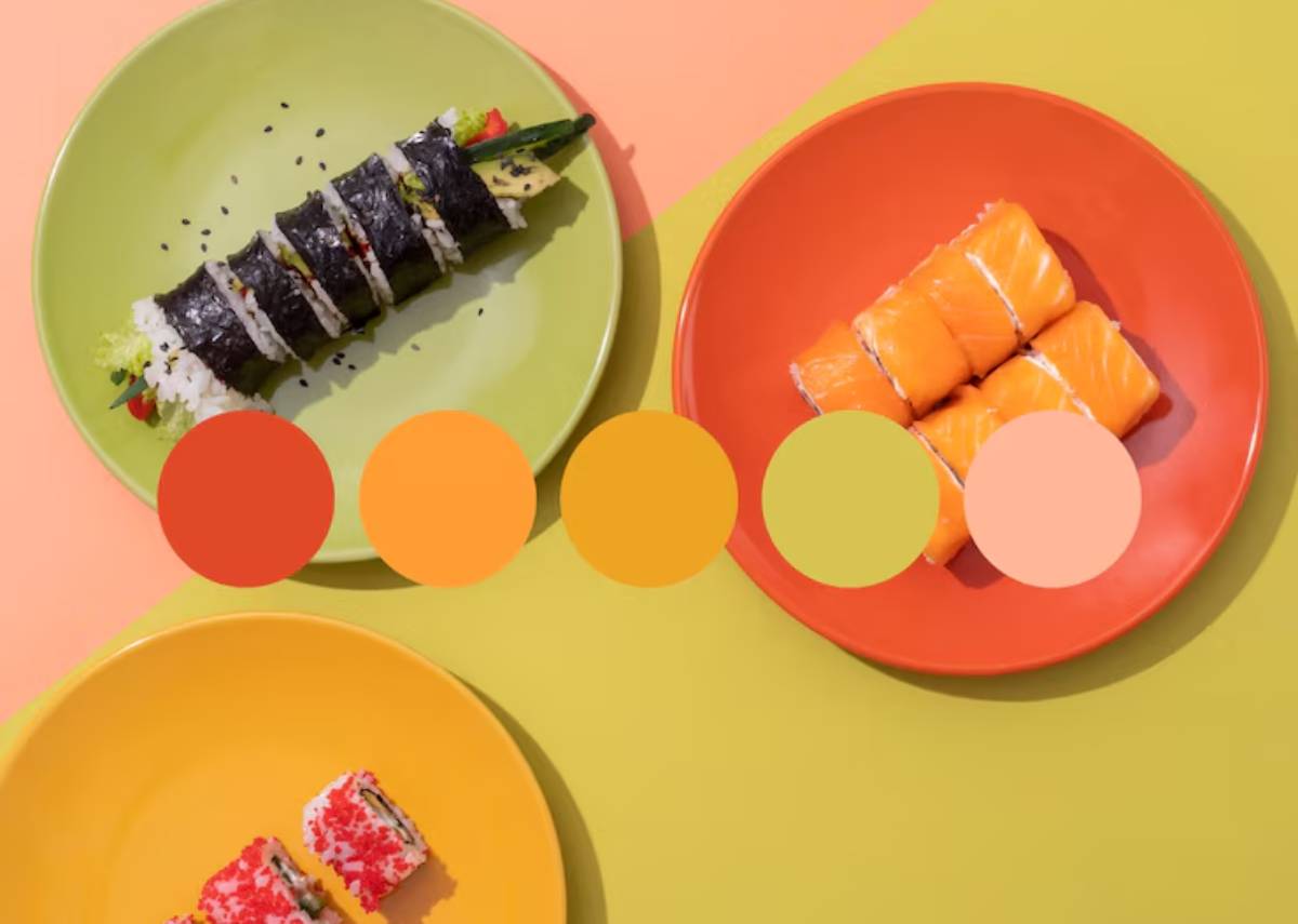
- Analogous colours: Next to each other on the wheel (e.g., red, orange, yellow) offer harmony.
- Triadic colours: Evenly spaced (e.g., red, yellow, blue) bring balanced, playful contrast.
Choosing colour intentionally means you can create either excitement or calm, boldness or subtlety — depending on your goal.
Real-world food pairings
- Red beetroot purée + green pea shoots = Complementary vibrancy
- Carrot mash + golden squash + paprika oil = Warm analogous harmony
- Seared tuna + avocado + mango salsa = Triadic brightness
Understanding the colour wheel helps you move beyond instinct and into strategy, and your dishes will look more polished for it.
Working with Natural Ingredients and Pigments
Leveraging nature’s colour palette
Many colourful foods get their pigments from natural compounds.
Those compounds often signal flavour:
- Carotenoids (carrots, sweet potatoes, peppers): Warm orange–yellow, sweet-earthy
- Anthocyanins (berries, purple cabbage, aubergine): Red–purple, tart–sweet
- Chlorophyll (leafy greens, herbs): Fresh green, grassy–bitter
- Betalains (beetroot): Deep red, earthy–sweet
Understanding what each colour tastes like helps you pair ingredients not just by sight, but by flavour harmony too — the essence of gourmet food colour pairing.
Intensity matters
You don’t need a rainbow on every plate. Sometimes a neutral base with a pop of intense colour — like a golden egg yolk on a cauliflower purée — is more impactful than a full spectrum. Use colour as an accent or a focal point, not just decoration.
Creating Contrast Through Colour
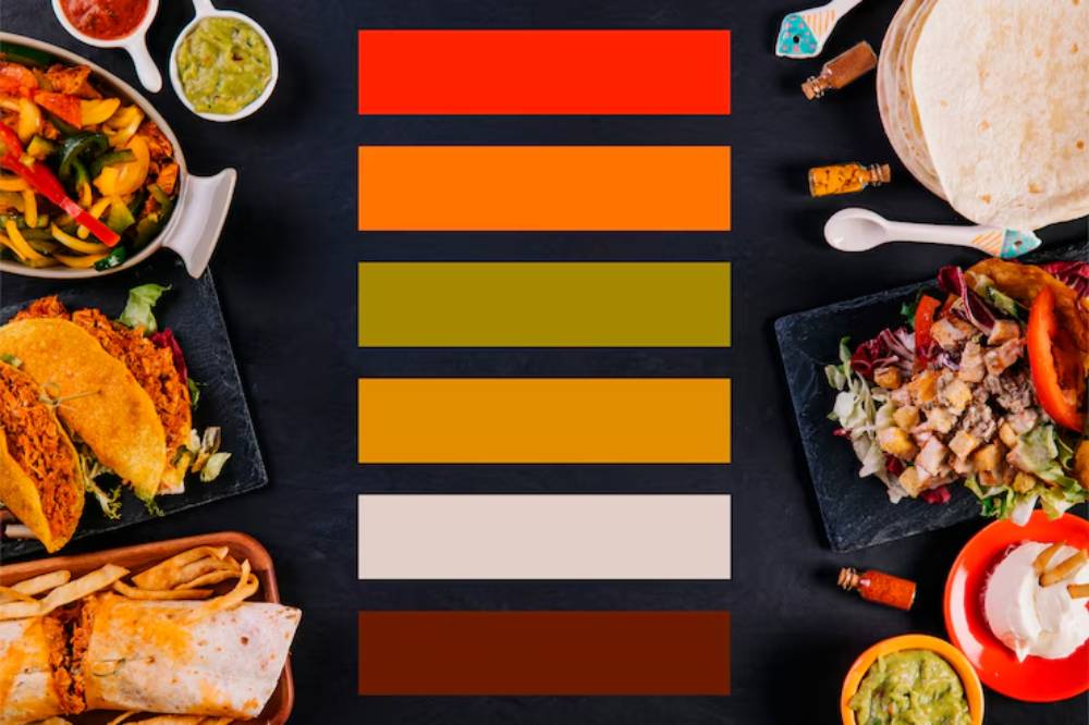
Why contrast makes a plate pop
Flat colours make a plate look dull. Contrasting colours create visual energy and guide the eye.
The easiest ways to create contrast include:
- Dark vs light: Think of grilled aubergine against whipped ricotta
- Warm vs cool: Butternut squash beside green herb oil
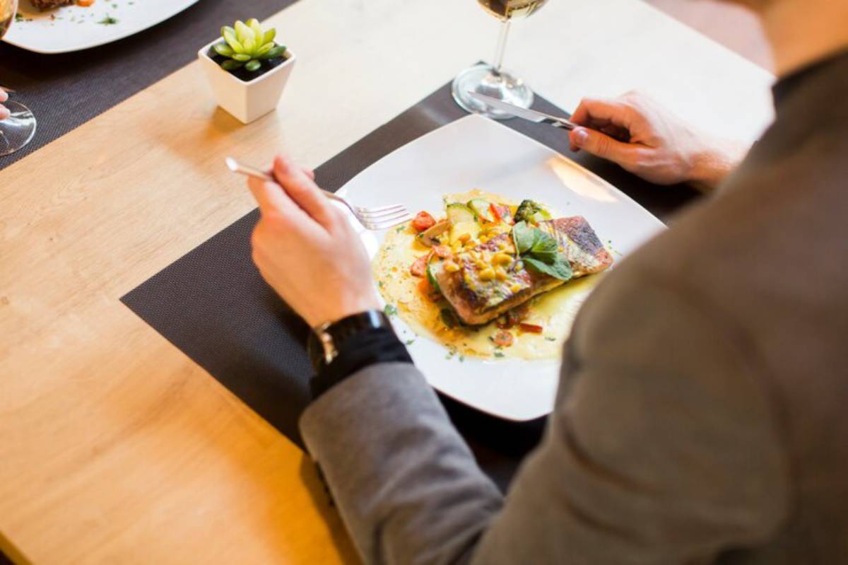
- Matte vs glossy: Crispy-skinned fish with a vibrant jus
Contrast also helps highlight the key element of the dish, drawing the eye to the “hero” without distraction.
Plating strategies for contrast
- Plate pale proteins (like chicken or scallops) on darker or colourful backgrounds
- Use small pools of vibrant sauces under or beside neutral elements
- Add freshness with raw herbs or pickled veg for bright green or pink accents
If you’re already mastering composition techniques, you’ll find that colour contrast pairs naturally with the layout principles covered in plating like a pro: elevate home dishes.
Colour Pairing by Mood and Meal
Setting the tone with colour
Certain colours evoke specific emotions and pair well with different types of dishes:
| Colour Palette | Feel | Great For |
| Warm tones (orange, red, gold) | Comforting, bold | Autumn dishes, meat, root veg |
| Cool tones (green, blue, violet) | Refreshing, calm | Salads, seafood, spring dishes |
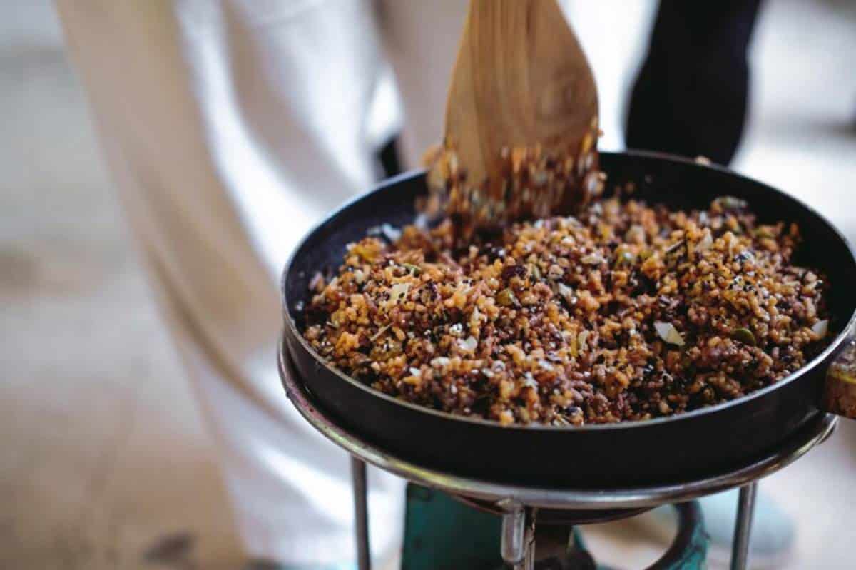
| Neutral tones (white, beige, brown) | Earthy, minimalist | Grain bowls, rustic plates |
| Jewel tones (ruby, emerald, sapphire) | Luxe, refined | Fine dining or special occasions |
Aligning the colours of your ingredients and plateware with the feeling you want to evoke deepens the experience, especially when hosting or plating for an event.
Using Plateware to Enhance Colour
Your plate is part of the colour story
Don’t underestimate the role your dishware plays in presentation. White is classic because it offers high contrast — but coloured, black, or textured plates can amplify or mute your chosen colour palette.
- Black plates: Make bright or light foods pop; perfect for bold, minimal plating.
- Earth-toned ceramics: Bring warmth and rustic charm to root veg and grains.
- Textured or patterned plates: Add visual interest, but can compete with complex dishes.
When planning a plate, think of the background as much as the food. It’s your canvas — use it well. When planning a plate, think of the background as much as the food. It’s your canvas — use it well. And once your colour palette is set, consider how garnishes like microgreens and edible flowers can subtly amplify your presentation through both contrast and cohesion.
Real-Life Example: Reimagining a Simple Dish
Let’s say you’re plating roasted carrots with goat’s cheese and dukkah. Sounds delicious — but it could look beige on beige if you’re not careful.
With a few intentional moves, you elevate the visuals:
- Add a green herb oil for contrast
- Choose a dark stone plate to anchor the warm tones
- Sprinkle pomegranate seeds for pop
- Dot the goat’s cheese instead of smearing it across
Suddenly, it’s not just dinner — it’s a dish you’d pay for in a restaurant.
Common Mistakes and How to Avoid Them
Mistake 1: Too much going on
Overcrowding the plate with too many colours can make things look messy. Stick to 2–3 main colours and 1–2 accents for clarity and cohesion.
Mistake 2: Ignoring the tone
Not all reds are created equal. A rich tomato red carries more depth than a pale radish pink. Think about the intensity of your colours and how they work together.
Mistake 3: Using artificial colouring
Natural food has beauty in its raw pigments. Skip synthetic sauces or food dyes — they often clash with the rest of the plate and can detract from the gourmet feel.
Practising Colour Theory at Home
Use your fridge as a palette
Next time you’re deciding what to cook, open the fridge and take a colour-first approach. What could you combine based on tone or contrast?
For example:
- Purple cabbage + orange carrot + creamy tahini
- Green peas + white fish + red pepper sauce
- Golden beetroot + green kale + pink radish
Let colour guide your creativity, and taste will follow.
Photograph and reflect
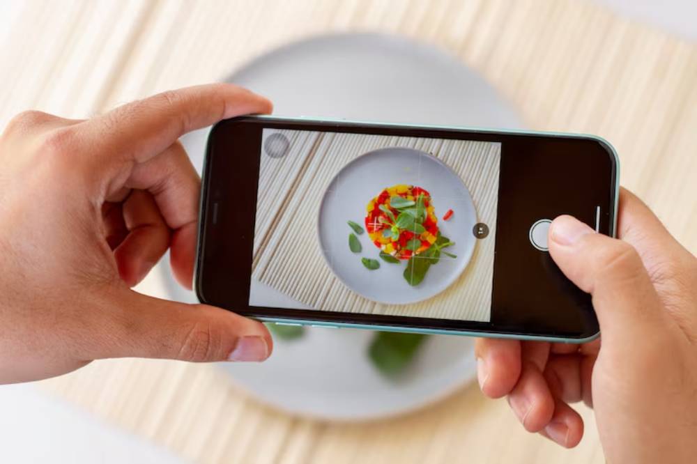
Take pictures of your plated meals.
Look back and ask:
- What worked visually?
- Was anything flat or dull?
- Could I add or subtract a colour for better balance?
This is how you build your colour instincts — one plate at a time.
Conclusion: Elevating Plates Through Colour
At its core, colour theory is about making deliberate, thoughtful choices — ones that heighten enjoyment, tell a story, and reflect your style. When you learn how to balance, contrast, and highlight with colour, every dish becomes more engaging, more expressive, and more satisfying.
Whether you’re plating for guests or just treating yourself to a better lunch, tapping into plating colour techniques turns the ordinary into the extraordinary. It doesn’t require expensive tools or culinary school training — just curiosity, practice, and a bit of playfulness.
So next time you’re in the kitchen, don’t just think about seasoning and timing. Look at your plate like an artist looks at a canvas — and paint with food.
